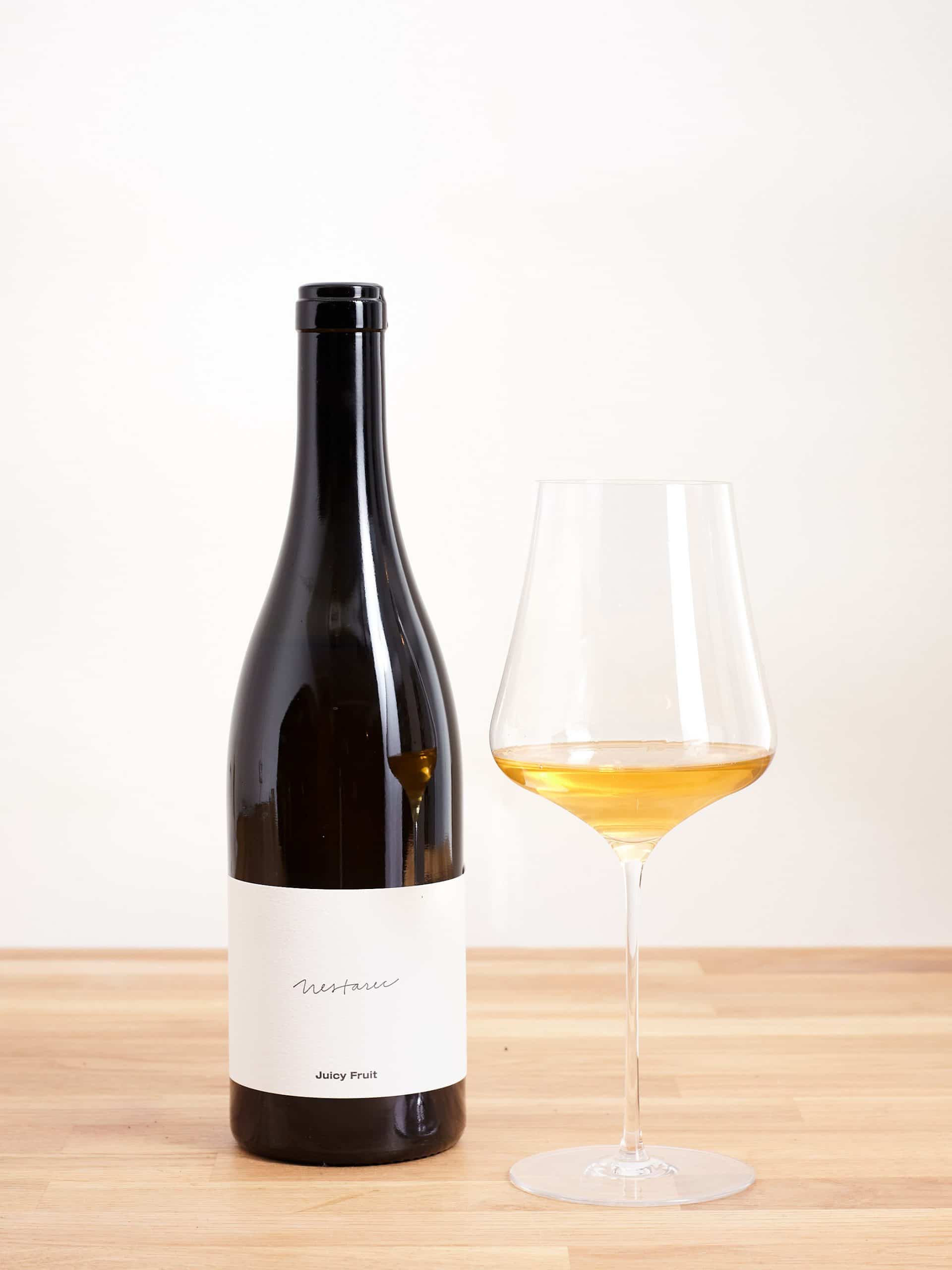
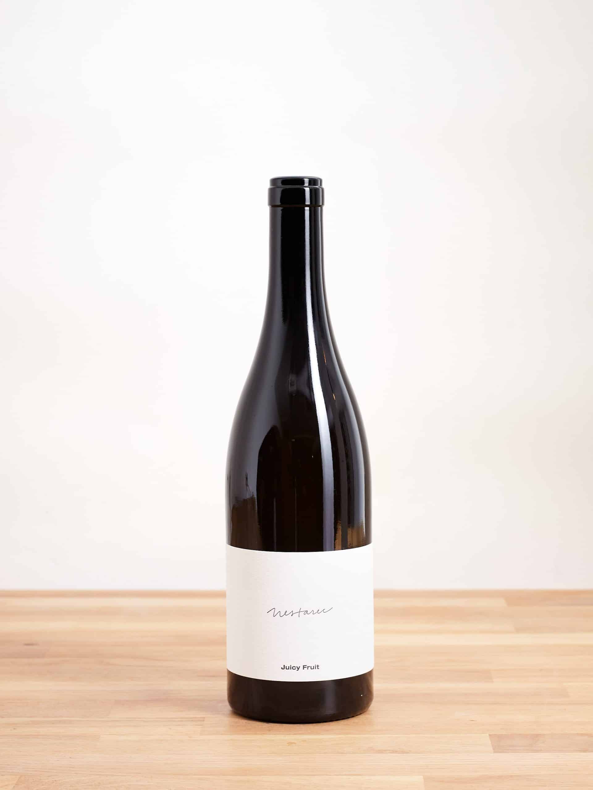
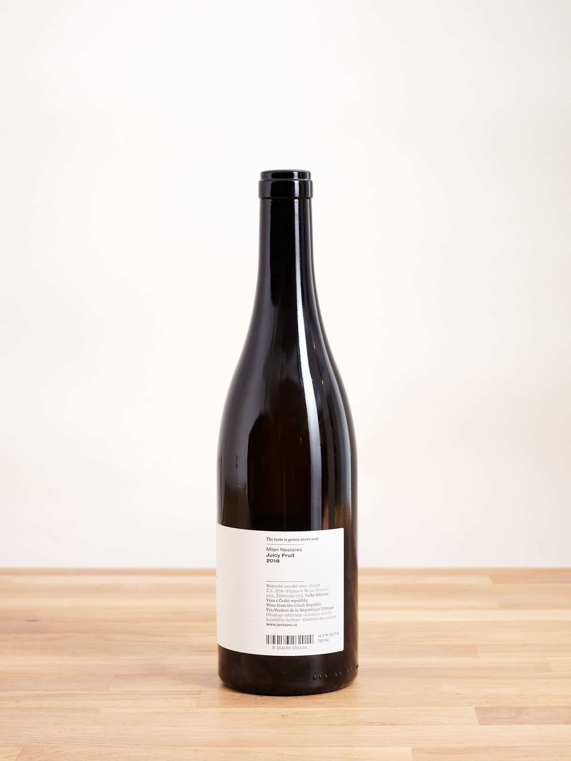
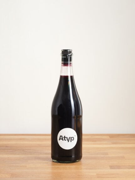
Milan Nestarec - Juicy Fruit 2018
The taste is gonna move you! For natural wine fans and skeptics alike! Milan Nestarec - Juicy Fruit 2018 is a revelation of freshness paired with a little creaminess.
WYLDNESS LEVEL 3

31,90 € VAT included
Unfortunately, finished for now. But we will be happy to inform you when it or a subsequent vintage is back in stock!

Fill your box full and help save CO2
We ship in boxes of 1, 3, 6, 9, 12 and 18

CO2 neutral shipping throughout Europe.
Additionally we plant a tree for every order from 50 €!

SSL encryption for secure payment
via Paypal, credit card, Klarna, Apple Pay and G-Pay and much more.
the wine
The taste is gonna move you!
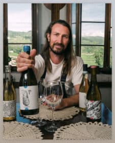
In Milan's words: is that blasphemy? To me, it's just who we are. We have no intention of imitating the Burgundy style. These grapes were simply historically planted in our vineyards and are in good condition so we work with what we have. But I like the thrill - if you have no expectations of how it should taste, no tradition to honor, there is always an element of surprise. And I love that. I know that you can find these grapes from Australia to Dresden and many people try to project a standardized international style onto them, often with new barrels. Even I drink such wine, occasionally. If he's really good. But even then, it just feels ... made for my taste. Like wearing a suit. Believe me, I feel awful all over the place. My Weinberg work clothes are who I am, my daily dress code. And that's what Juicy Fruit is all about.
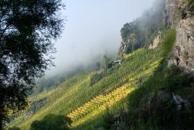
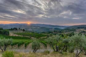
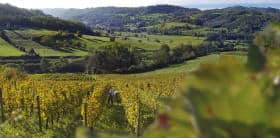
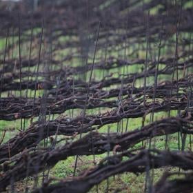
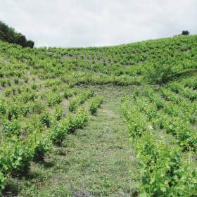
As of 2018, all White Label wines are field blends from old vines that grow on a single vineyard (or two neighboring plots). In this case it is the Oplocenka & Achtele layers that are blended with Pinot Gris, Pinot Blanc, Pinot Noir, Veltliner and Welschriesling. We selected our top vineyards to give the wines maximum longevity & genius, and use minimal skin contact (max. 10% and even that very rare) to present this unique, beautiful material without a heavy orange veil. Spontaneous fermentation with local yeasts in larger old barrels made of local oak or acacia wood, where it then lies undisturbed on its fine lees for ~ 2 years. No fining or filtration, no sulfur addition. The normal way, to put it simply.
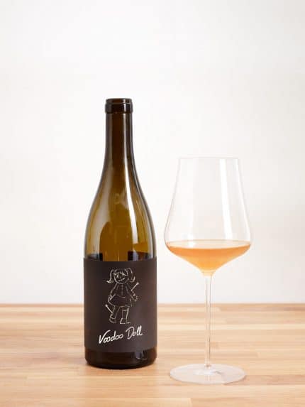
The story behind the White Label I'm sure about 200% that the most important thing is the person who makes the wine. It's not about a grape variety or a famous village in a famous region - because these wines can also get the bad karma of being massacred in the cellar. It's all about the name on the bottle. A name you can trust because you know how the winemaker works and that it's a style that you like. Hence the white Nestarec label with my signature on it. (A little prettier than in real life, because my usual scribble is illegible.) Together with Tereza, my graphic designer, we started to remove elements that were not essential - until only “Nestarec” and the name of the wine remained. A puristic approach to what is in and on the bottle. Because, as the saying goes: Perfection is not achieved when there is nothing more to add, but when there is nothing more to take away.
I don't want to look like a born sage - it took me some time to get there. My path, like that of many others, is paved with gold engravings and flourishes, like on a fancy gravestone. “Nestarec, a wine for funerals”, as a friend of mine called it at the time. Oops. But I like to remember that time - it is part of my development. No regrets like in that famous Edith Piaf song.
Winemakers
Milan Nestarec
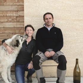
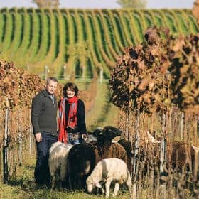
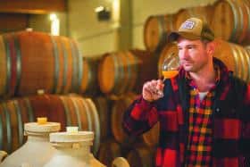
"Made of grapes, nothing else." is Milan's motto. Milan Nestarec is one of the new wild young winemakers from Europe. He makes fantastic wines that reflect the region. Mostly pressed with peel contact. For Milan Nestarec, the vineyard is the body and the cellar is the heart of his wine.
morefacts
| Winemakers | |
|---|---|
| Wyldness | LEVEL 3 |
| Grape varieties | |
| country | |
| region | |
| vintage | |
| size | |
| alcohol | |
| Vinification | |
| Allergens | Contains sulphites |
| Bottled by | Milan Nestarec, Záhumní 449, 691 01 Moravsky Zizkov, Czech Republic |
| Drink at |
